0 to 1 Product Design User Research Prototyping AI Product UCLA Extension 2022

Swing With Me — An AI Stroke Coach in Your Pocket

A native iOS app that records your tennis strokes, compares them frame-by-frame to a pro's form, and delivers the coaching feedback most players can't afford.

UX Designer (Solo)
12 weeks
Adobe XD, Figma, InVision
UCLA Extension, Summer 2022
Swing With Me splash screen Home dashboard with streak progress YOU vs PRO stroke comparison

Getting better at tennis without a coach is nearly impossible — unless you build the coach.

Tennis improvement requires real-time, specific feedback from someone watching you. Without a coach, you keep reverting to the same bad habits. I designed an app that does what a coach does: breaks down where your form differs from a pro's, stroke by stroke.

Proposed solution slide showing AI and ML concept with Federer reference

Five interviews. One critical pivot: drop the beginners.

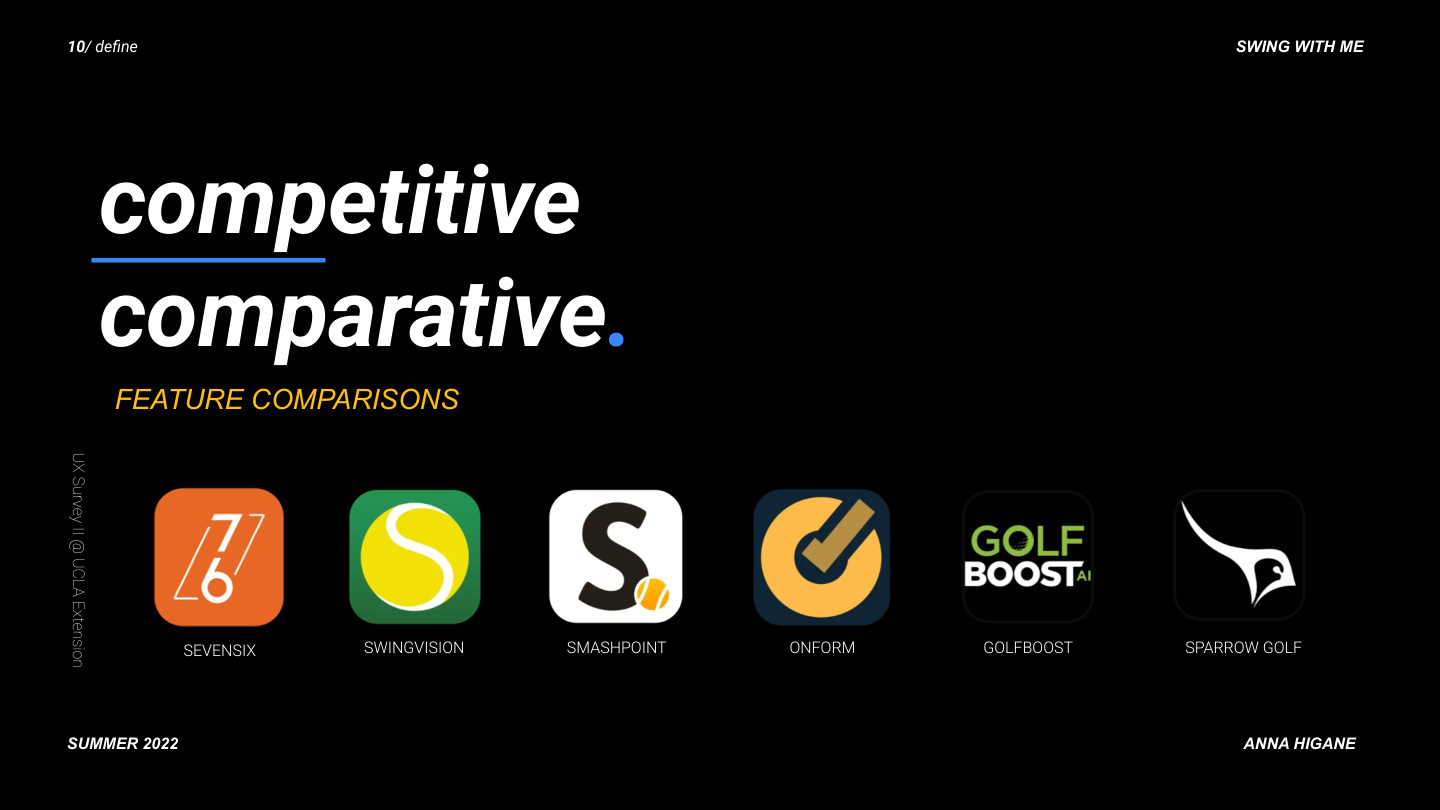
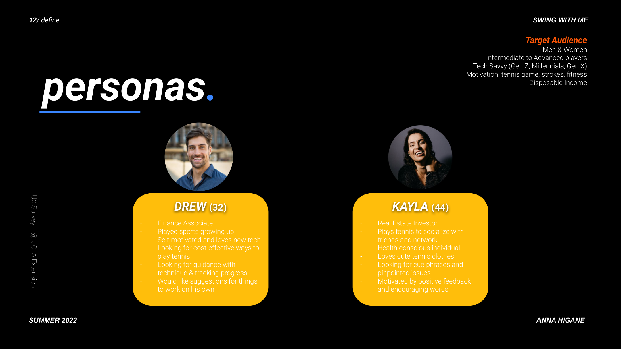
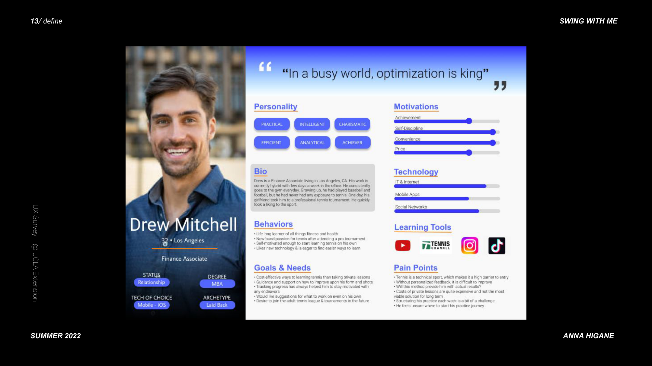
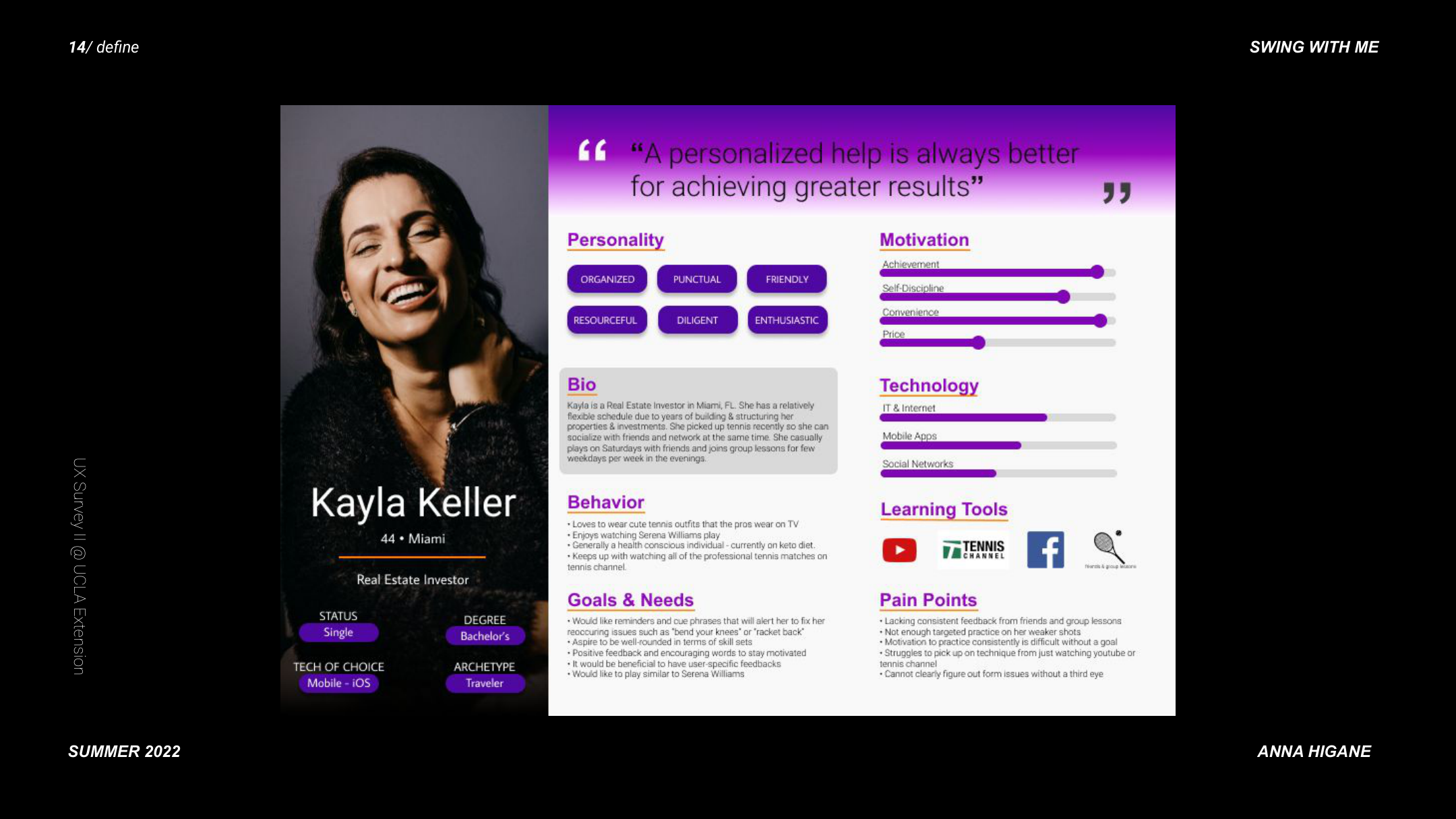
I interviewed recreational tennis players across skill levels and ran a competitive analysis across 6 existing apps. The biggest finding was about audience, not features.

Seven research interview questions and affinity map
User feedback synthesis showing pain points, goals, needs, and potential features
Key insight: accountability, guidance, and score tracking
Feature comparison matrix across 6 competitor apps

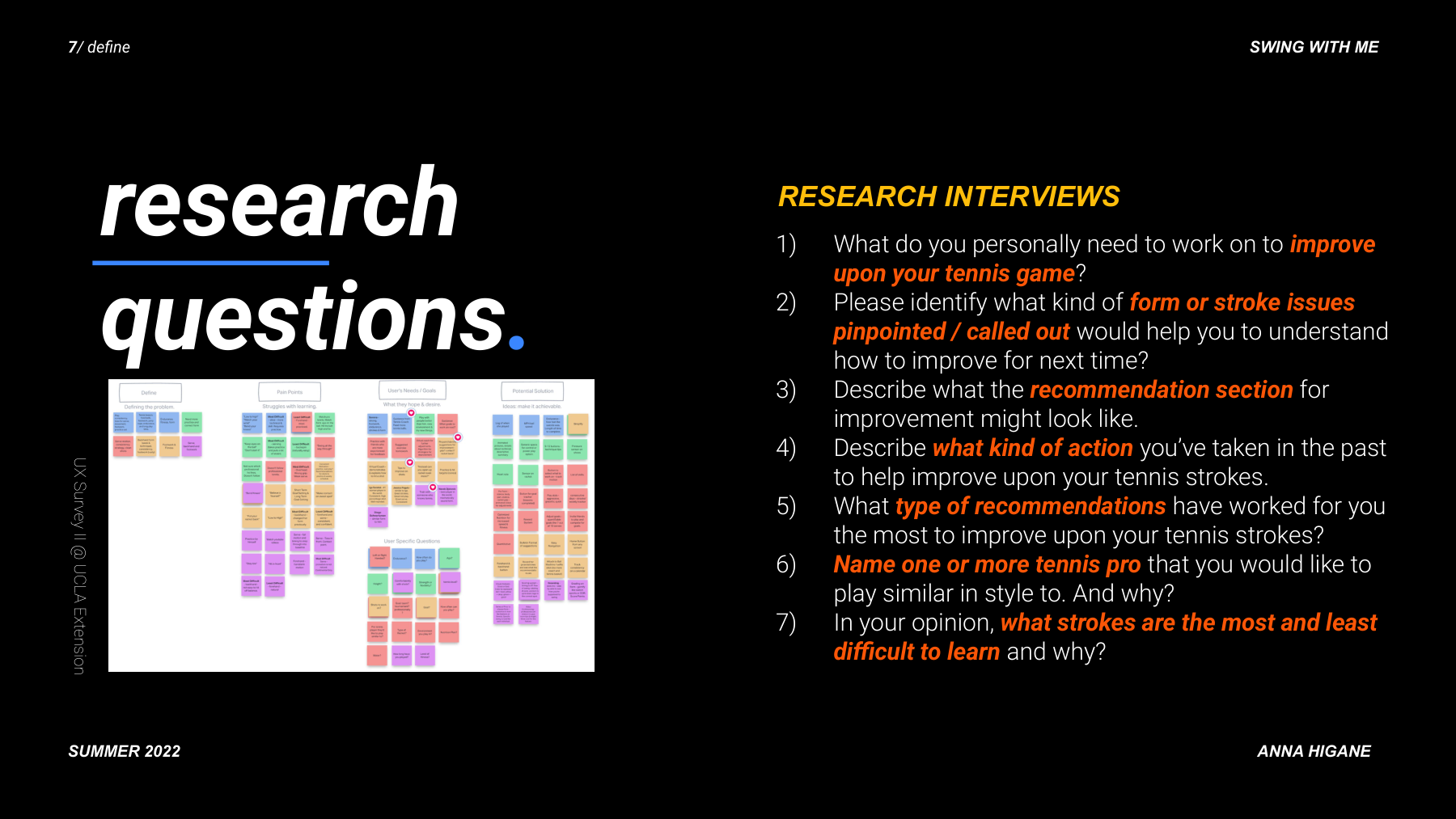
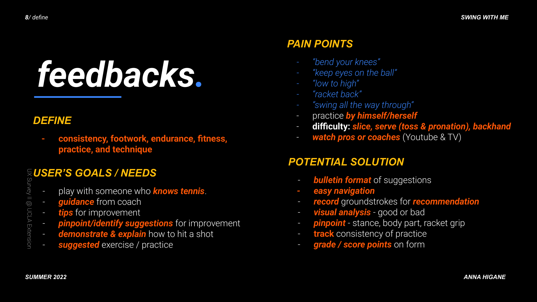
Beginners needed foundational instruction first. Intermediate players had specific, named problems. I pivoted to intermediate players, which simplified every subsequent design decision.

Personas overview — Drew (32) and Kayla (44), target audience for Swing With Me
Drew, 32 — tech-savvy intermediate player, motivation: improve technique without expensive coaching, frustration: no feedback loop
Kayla Keller, 44 — fitness-motivated recreational player, motivation: stay consistent and track progress, frustration: no accountability system

From user flow to paper prototypes to hi-fi — in 12 weeks.

Complete user flow diagram from app launch to actionable feedback
Full site map showing all screens and navigation hierarchy

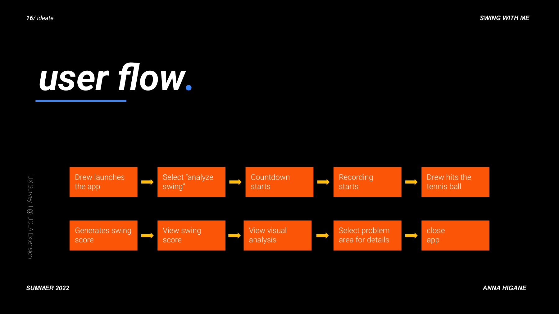
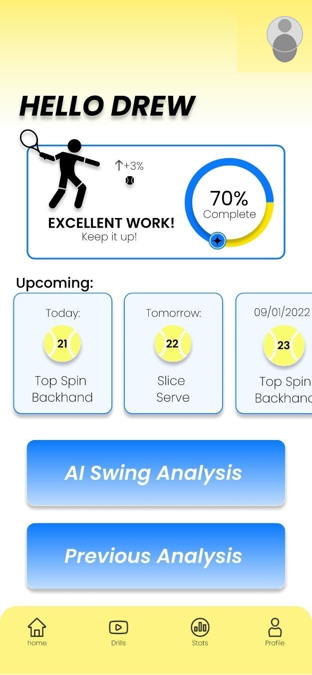
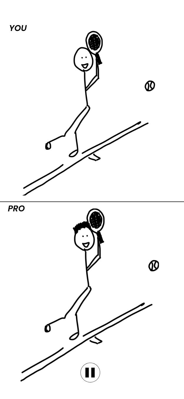
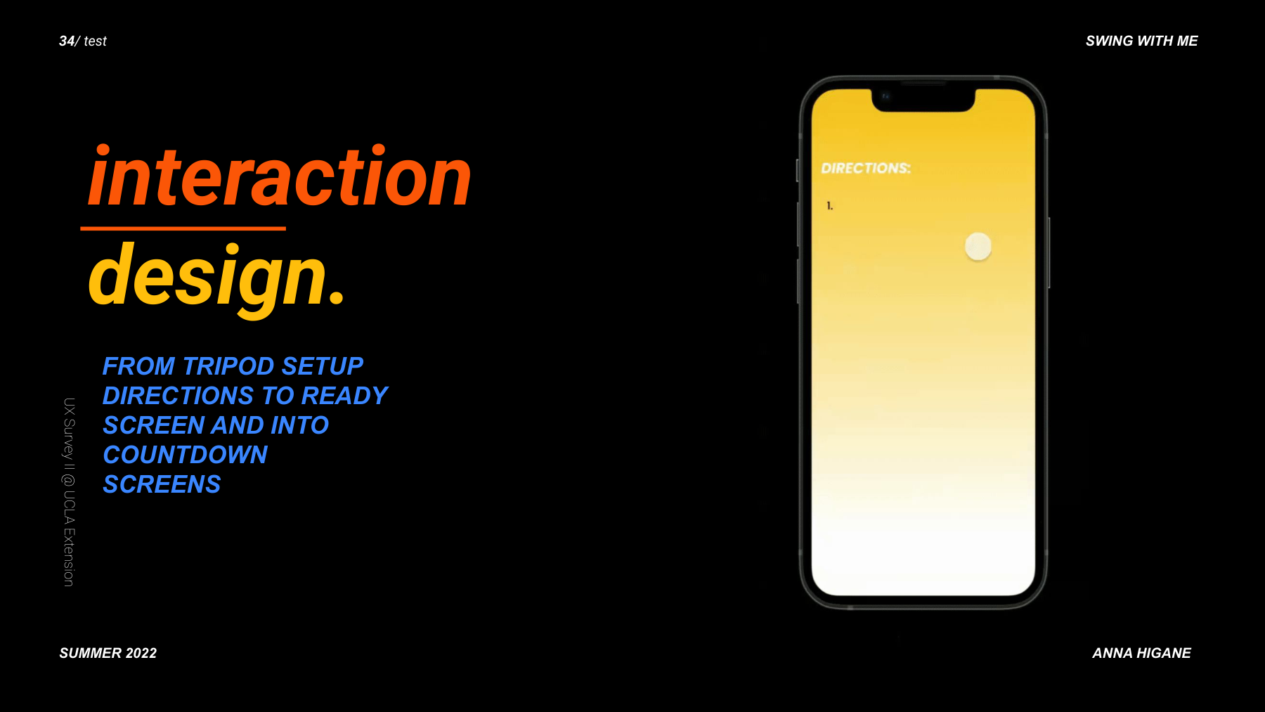
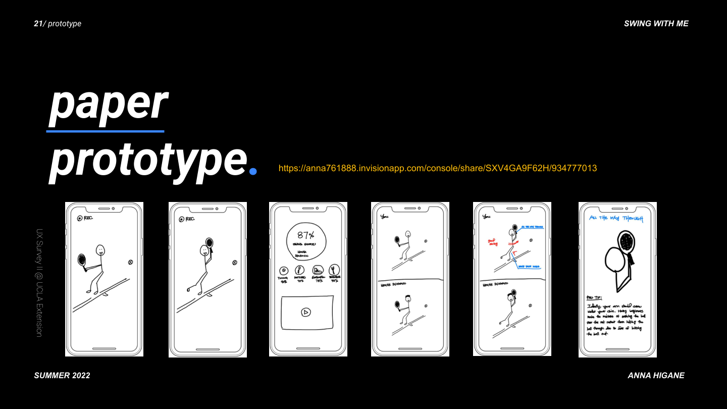
Paper prototyping came first. Every screen started as a sketch before any pixel work.

Paper prototype: first 6 screens from splash to countdown
Paper prototype: next 6 screens from recording to pro tip

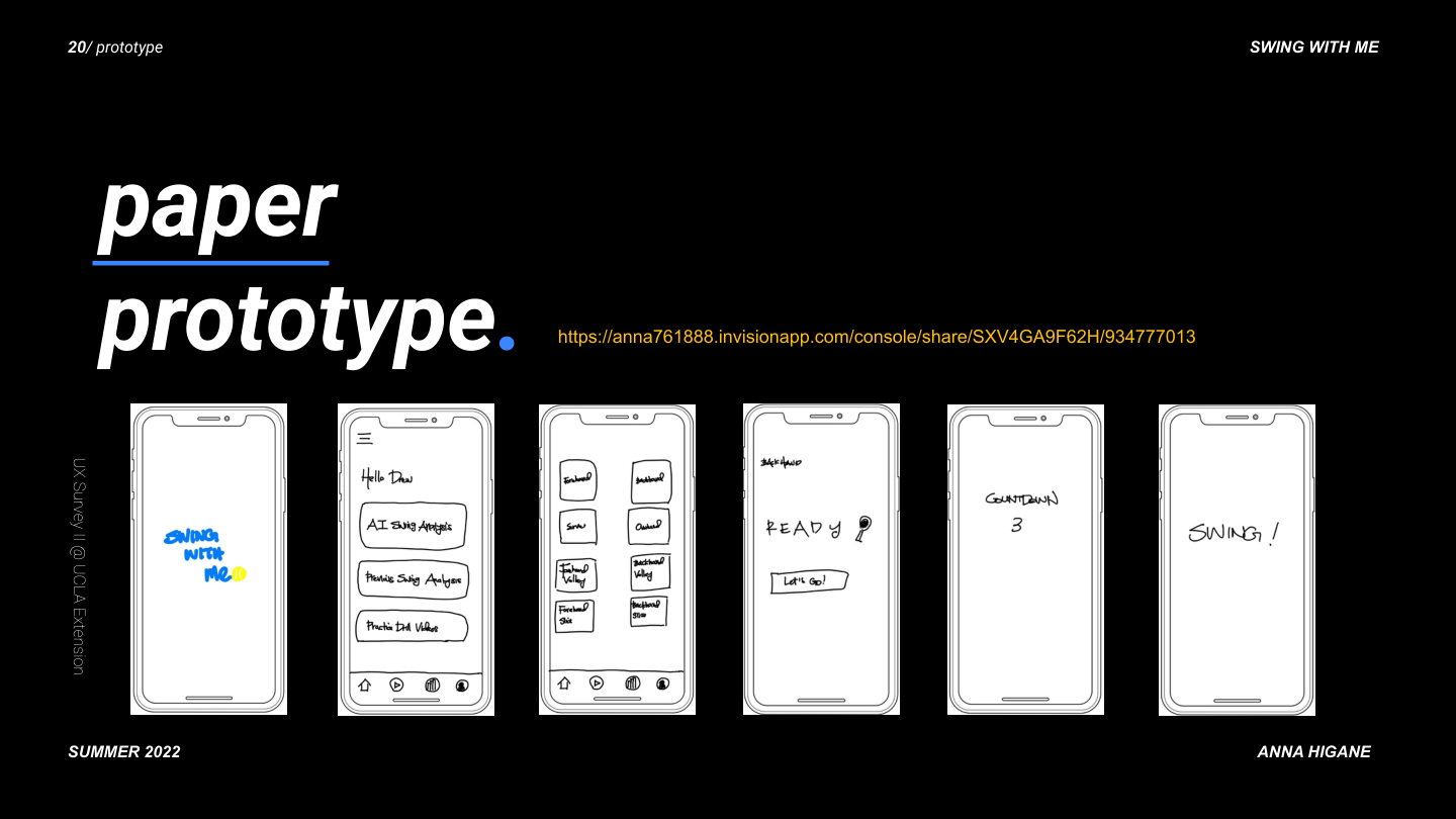
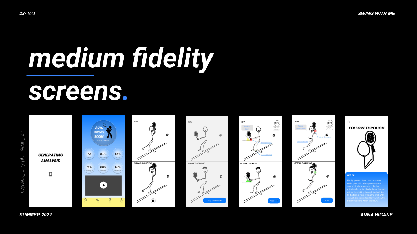
The design evolved through four distinct fidelity stages. This slide captures the full progression.

Design evolution from paper to lo-fi to medium-fi to hi-fi with timeline

The real product. Real photography. Real AI feedback.

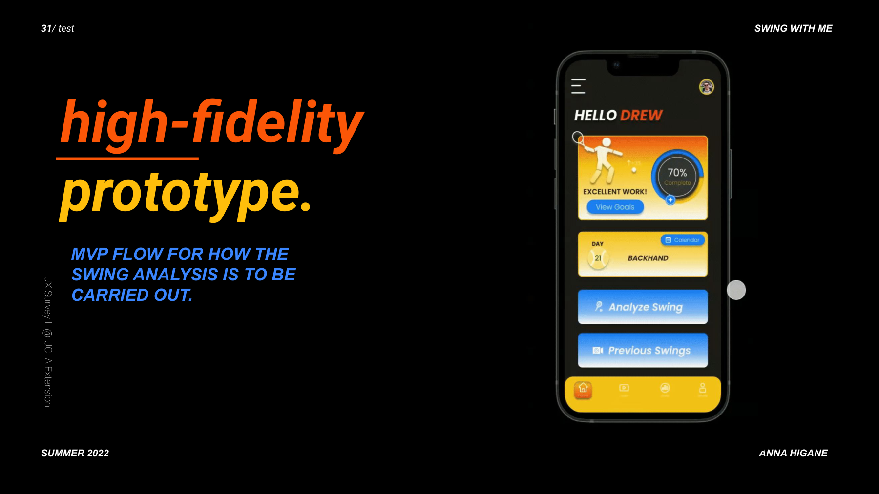
The hi-fi prototype moved from stick figures to real tennis footage, real player comparisons, and a dark-themed UI designed for on-court readability.

Complete hi-fi app showcase: all 27+ screens arranged together showing onboarding, analysis, scoring, drills, goals, and profile
SWING. hi-fi onboarding splash — dark theme with tennis ball and blue Get Started CTA
Onboarding — SWING. splash with AI tagline
HELLO DREW hi-fi home screen with 70% completion ring, daily practice, Analyze Swing and Previous Swings CTAs
Home — accountability: goals, streaks, daily drills, AI analysis CTA
YOU vs PRO with real photography — user's tennis form compared to Djokovic with visual cues, verbal cues, form feedback annotations, and Follow Through pro tip screen with detailed coaching text

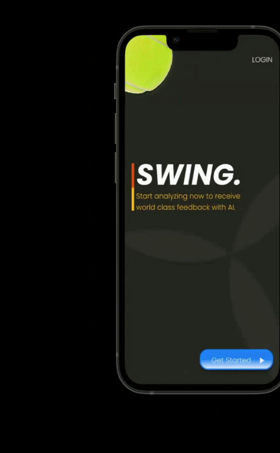
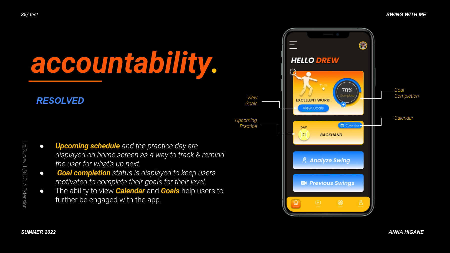
The core screen: YOUR footage compared frame-by-frame to Djokovic's. Visual cues highlight form differences. Verbal cues explain what to fix. The Follow Through screen delivers specific coaching text.

72% SWING SCORE with real tennis footage — posture 68%, technique 65%, stance 77%, footwork 73%, timing early, topspin type. Progress bars for improvement and consistency.
Annotated home screen with callouts for View Goals, Upcoming Practice, Goal Completion, Calendar
Score tracking slide with Swing Score breakdown and progress tracking

Five participants. Prioritized features. One key iteration.

Feature prioritization matrix by impact and expectedness
Rainbow spreadsheet usability test results for 5 participants, color-coded

Challenges, pivots, and what I would do differently.

Key challenges and pivots encountered during the project
Lessons learned with phone mockup

The AI feedback results were designed as a black box. Participants wanted to understand the reasoning behind their score, not just see the gap. A second iteration would focus entirely on the annotation and scoring explanation layer.