Hot 8 Yoga — Redesigning a Yoga Studio Booking Experience
Hot 8 Yoga's app made it hard to find and book the right class. Through competitive analysis, user research, wireframing, and a fully annotated hi-fi design, I redesigned the experience to reduce friction and give the brand a visual identity worth keeping.
UX Designer (Solo)
10 weeks
Adobe XD, InVision
UCLA Extension, Spring 2022
01 — The Problem
A popular yoga brand with an app that didn't match the quality of its studios.
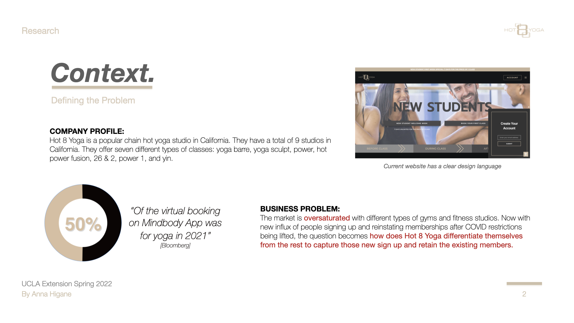
Hot 8 Yoga is a well-established yoga studio chain in California with 9 locations. Their app serves as the primary booking channel — but the experience wasn't designed around how students actually search for and select a class.
Post-COVID, the fitness app market was flooded with new competitors. The business problem was clear: how does Hot 8 Yoga differentiate itself to capture new sign-ups and retain existing members?
"The booking page is the most important page in the app — but it wasn't designed like it was."
02 — Research
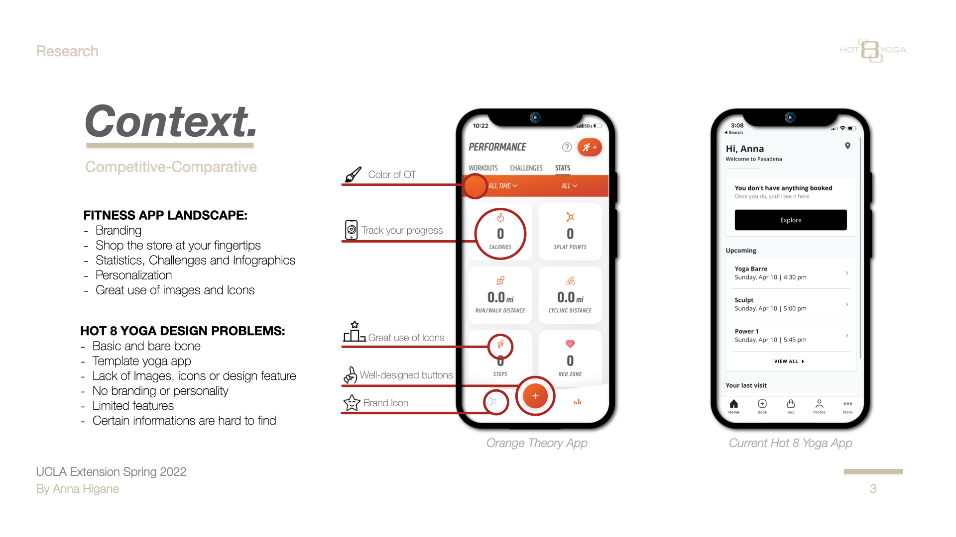
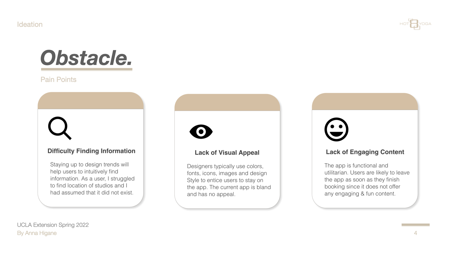
Competitive analysis and user testing revealed three root causes.
I benchmarked Hot 8 against Orange Theory — best-in-class fitness app design — and conducted a heuristic evaluation against Nielsen's 10 usability heuristics. I also ran moderated in-person user testing with participants who matched the studio's target demographic.
Three pain points emerged consistently across every participant:
Difficulty Finding Information — users couldn't intuitively locate studios or filter classes by what mattered to them
Lack of Visual Appeal — the app felt generic with no brand personality or imagery
Lack of Engaging Content — nothing to keep users in the app once a booking was complete
03 — Customer Journey Map
Misty's journey — from awareness to loyalty.
Mapping Misty's end-to-end experience revealed exactly where the app was losing her — and where the biggest design opportunities were.
Awareness
Consideration
Purchase
Use
Loyalty
About
Heard or saw something about the studio — curious, not yet committed.
Googles the studio, checks reviews on Yelp and Google to validate.
Finds the "$8 first week" deal. Downloads the app to make booking easier.
Logs in, tries to book classes. Can't find all studio locations. Has to Google info the app should provide.
Shares the $8 deal with friends. Purchases full monthly membership.
Feeling
"Hmm. Wonder what that yoga studio is like."
"Looks like a cool studio! I want to check it out."
"I like that there's a $8 trial week! Oh and an app too! NICE!"
"Wish certain things were more clear on the app."
"Could be better, but still a good experience!"
Sentiment
🤔
🙂
😄
😮
😊
Opportunities
Ensure studio info and photos are on all review platforms. Encourage existing yogis to write reviews.
Same — ensure consistent brand presence on social media and review sites.
Add QR code option. Simplify $8 sign-up flow. Make class offerings easy to scan.
Show all studio locations in-app. Surface key info without forcing users to Google. Add Apple Pay / Google Pay.
Offer referral promotions and discounts. Social media engagement features. Free trial extension.
04 — Personas
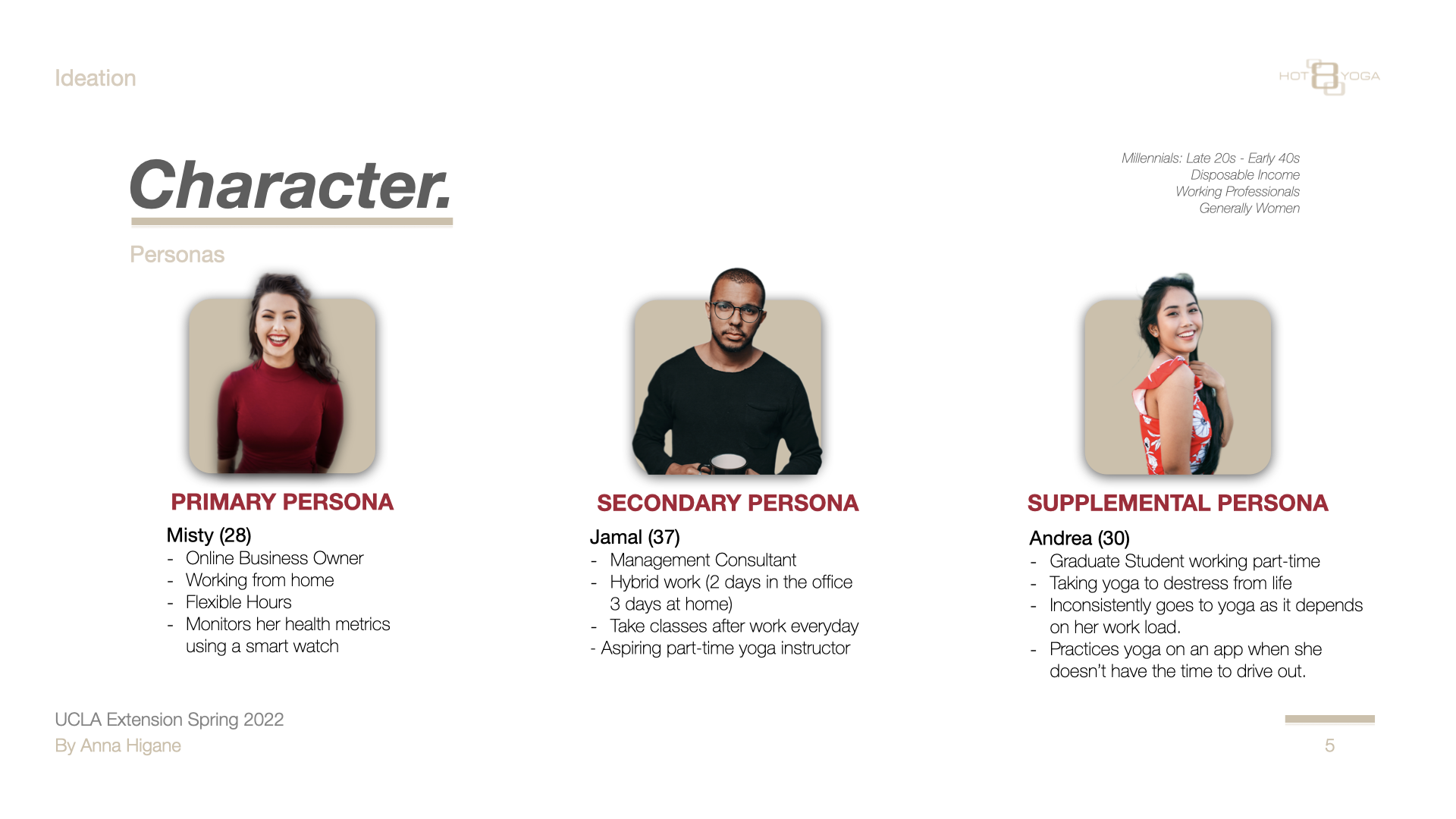
Three personas — one primary, two supporting.
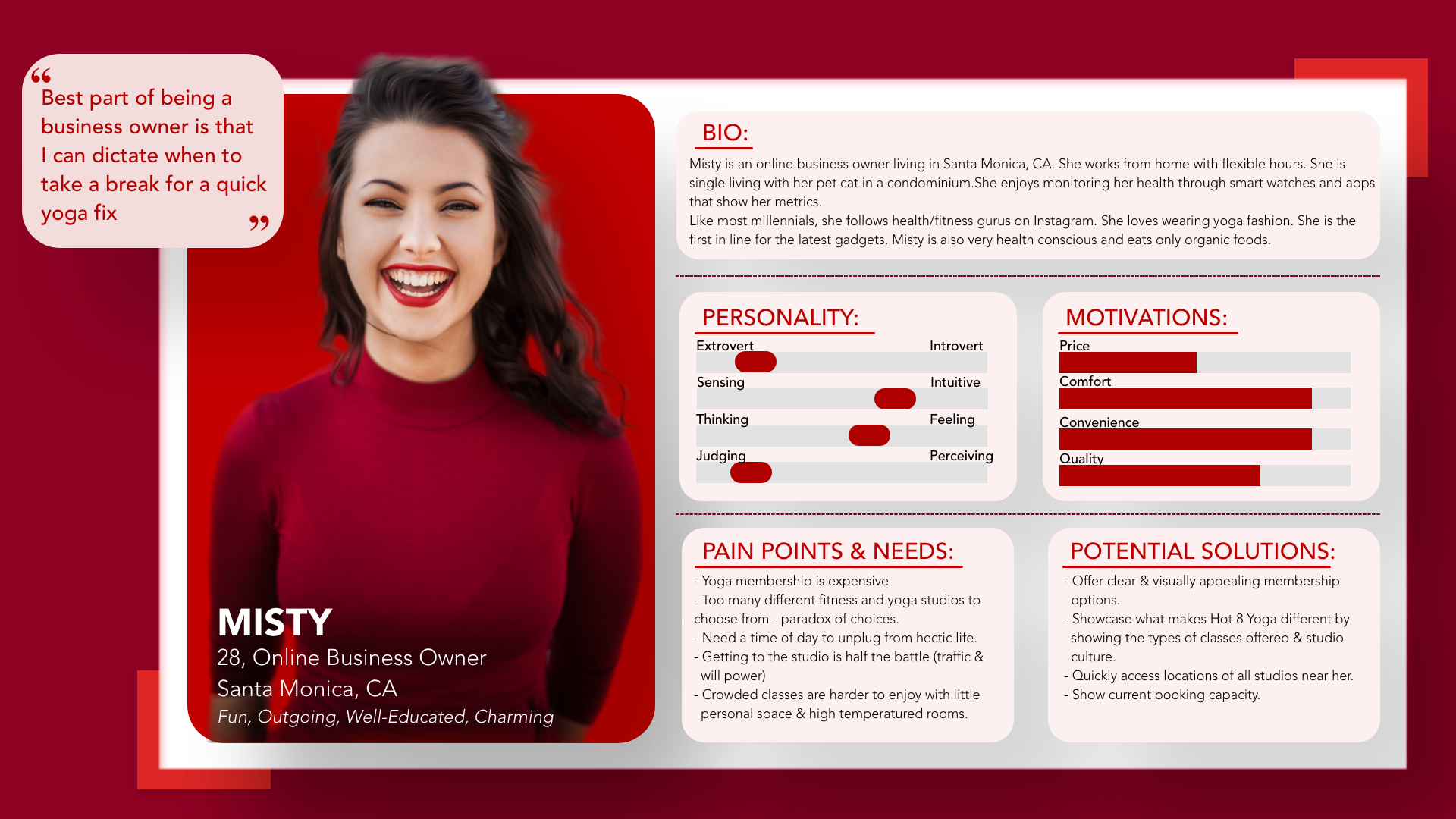
Based on the research, I built three personas. Misty is the primary — every major design decision was made for her.
Misty works from home, monitors her health obsessively, and expects apps to do the organizing work for her. She wants to book quickly without hunting, and will leave the moment it feels like effort.
Supporting personas — Jamal (37, management consultant) and Andrea (30, graduate student) — validated that the core booking frustrations weren't unique to Misty:
05 — Process
From UX strategy through five stages of design iteration.
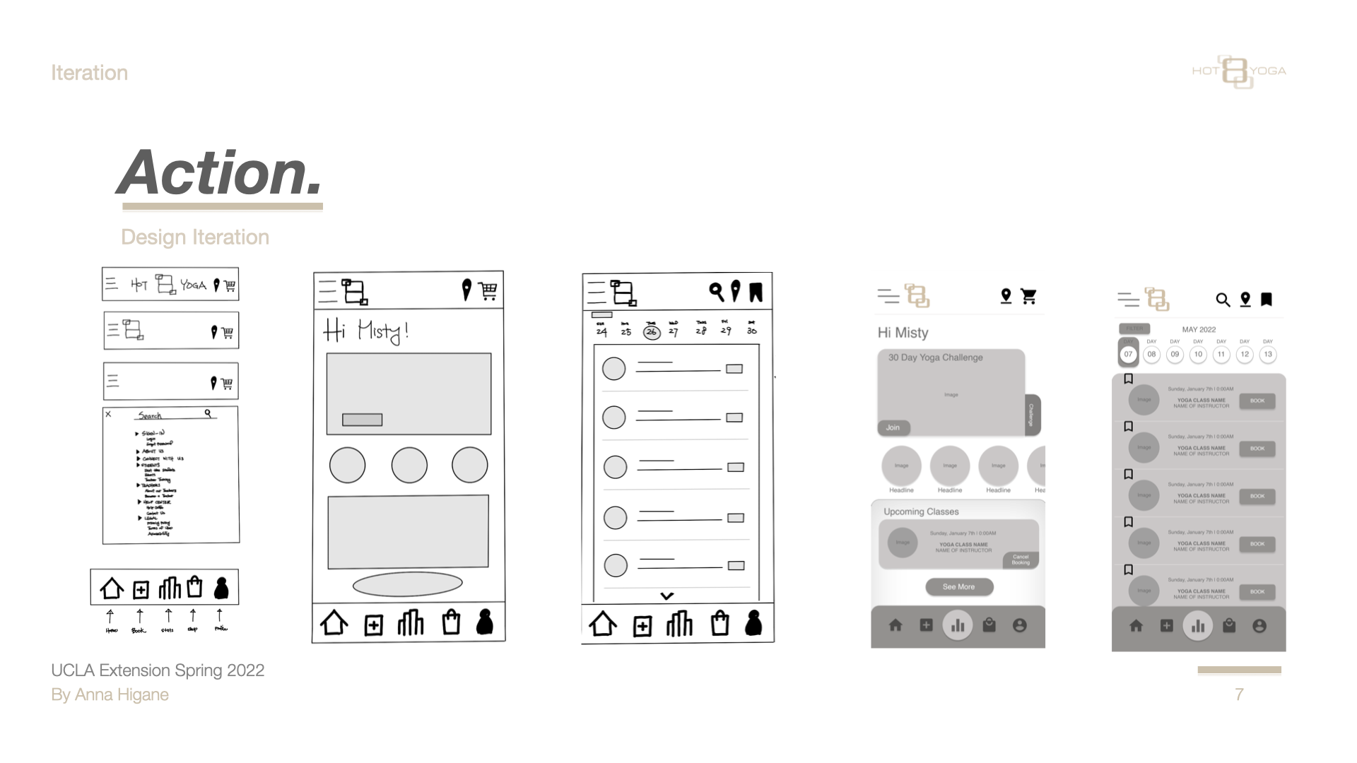
The vision: create an informative, accessible, and engaging app — one that lets users book classes, join challenges, view statistics, and connect with the brand. I moved through: Creative Brief → Competitive Audit → UX Strategy → Sitemap → Paper Sketches → Lo-fi → Mid-fi → Hi-fi → UX Annotations → User Testing.
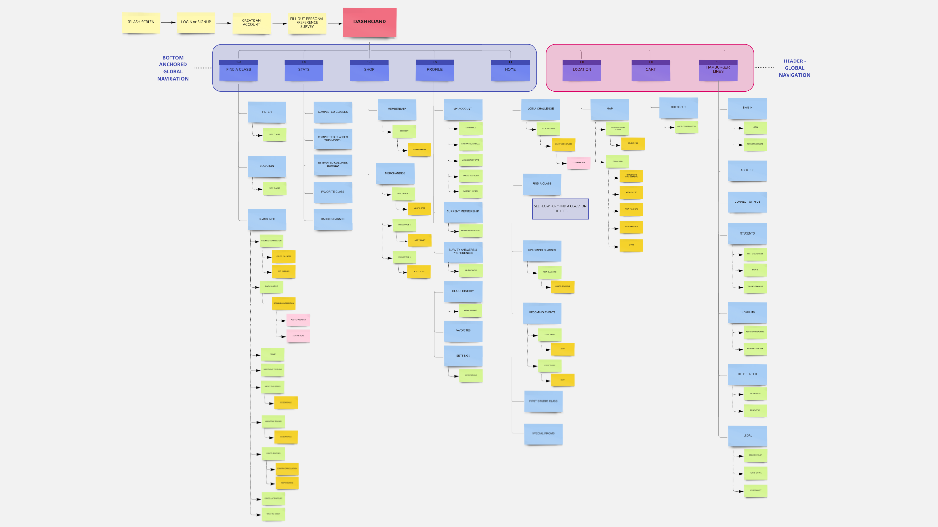
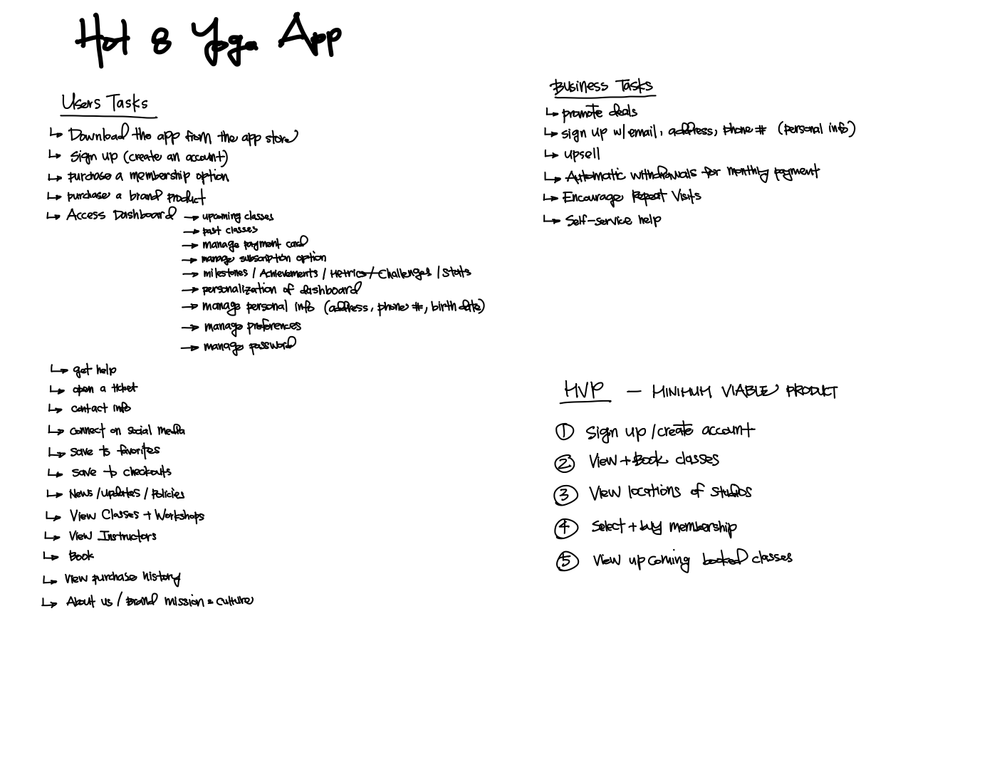
Full app sitemap — every screen and pathway mapped before wireframingUX Strategy — user tasks, business tasks, and MVP definition
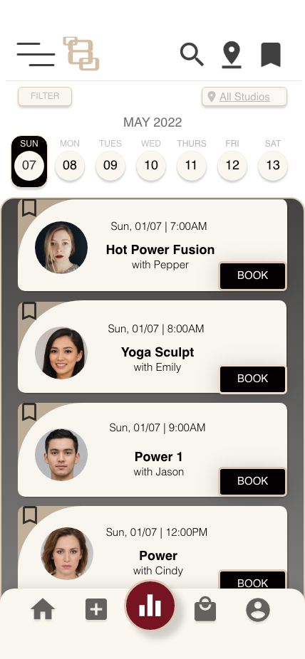
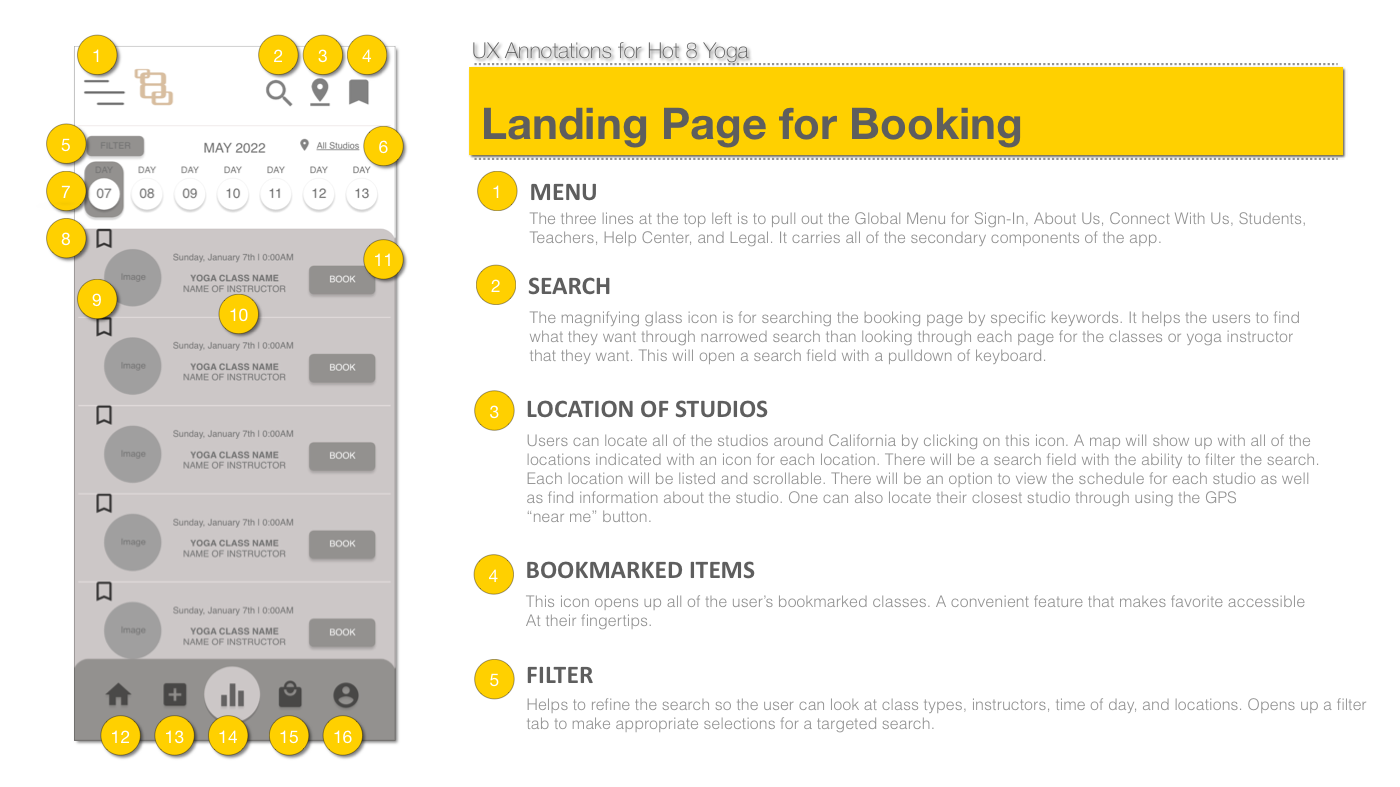
The key design decision was the booking landing page: horizontal day-scroll calendar at top, filterable class list below with instructor photo on each row, and a per-class Book button. I documented every decision in a 16-callout UX annotation document.
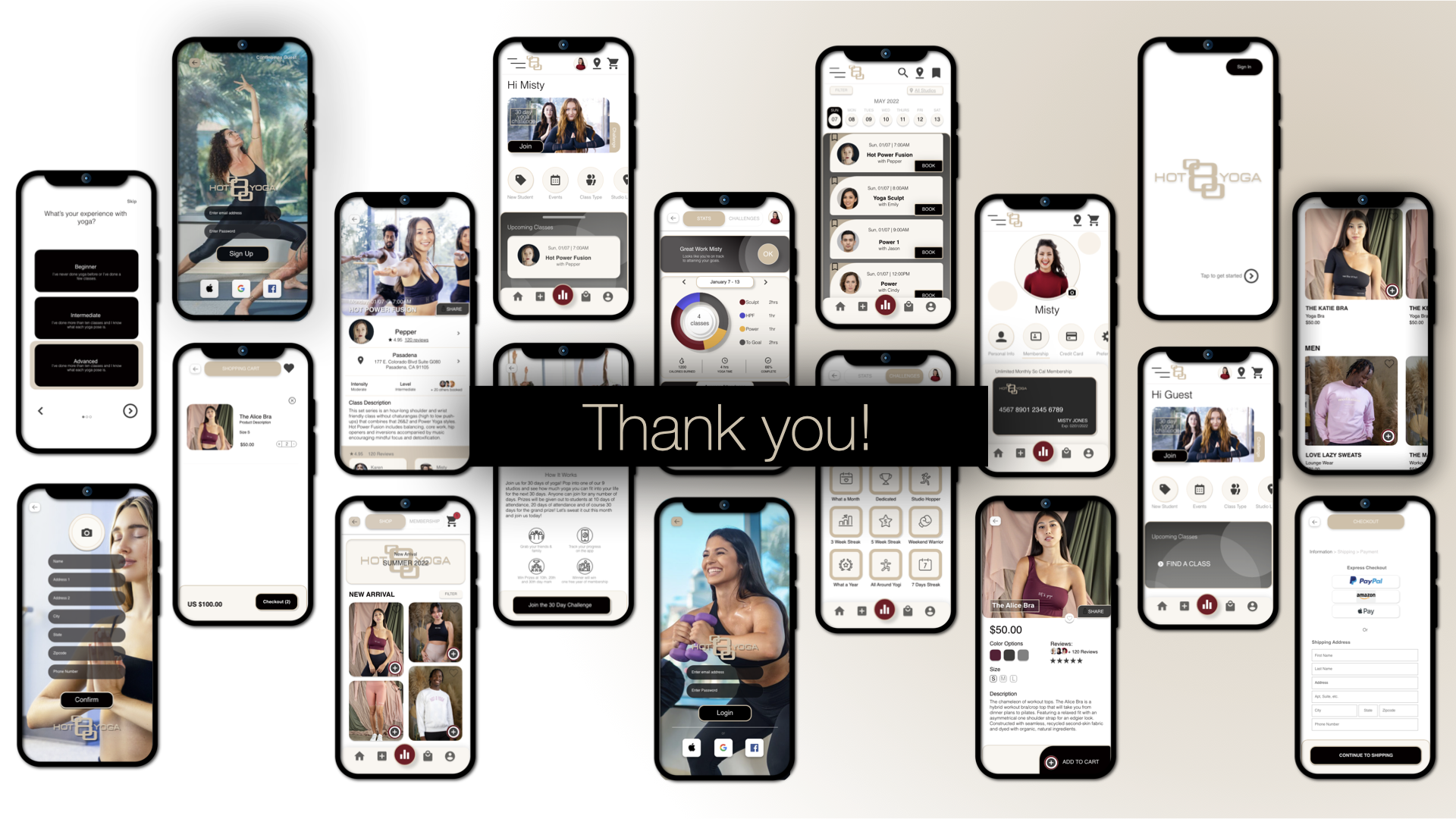
06 — Final Design
The complete redesign — every screen, in context.
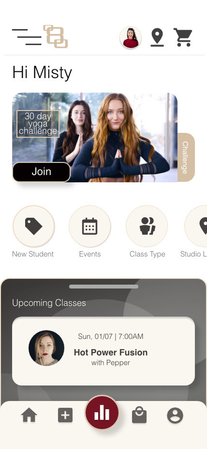
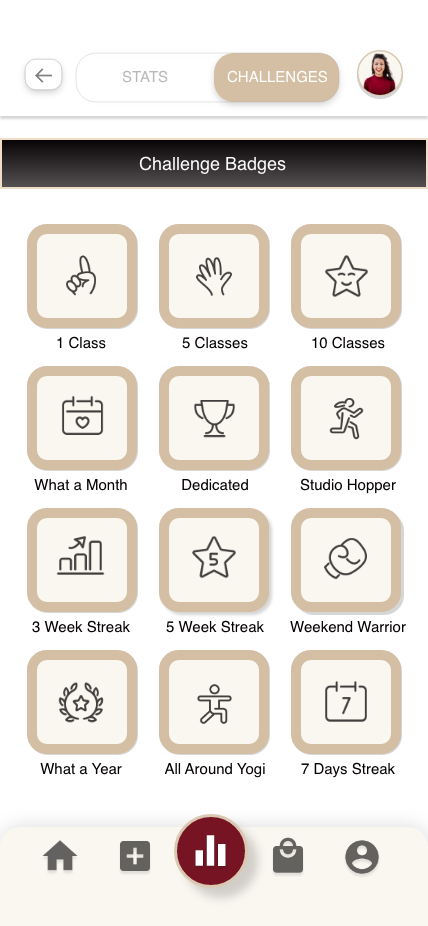
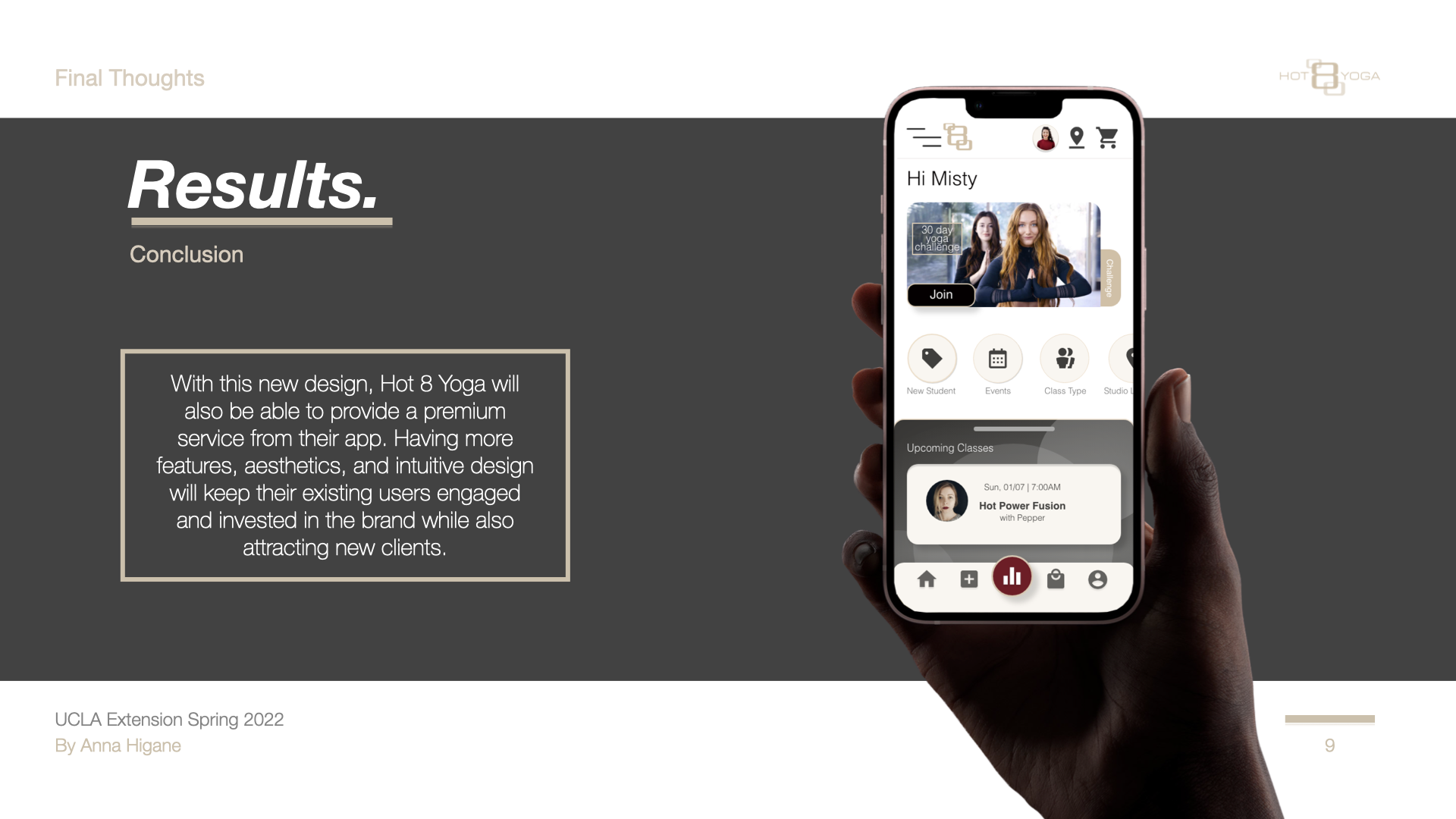
The hi-fi prototype transformed a bare-bones template into a full-brand experience: real yoga photography, personalized home screen, gamified challenges, and a booking flow built around how Misty actually thinks.
The annotated booking screen documents all 16 design decisions:
16-point UX annotation — every design decision on the booking screen documented: why it exists, where it lives, and how it behaves when activated
07 — Outcome
A tested, documented redesign with clear design rationale.
The redesigned experience was tested with real users in moderated in-person sessions. Participants completed key tasks — finding a class, filtering by location, and completing a booking — with significantly less hesitation than in the original flow.
Deliverables: creative brief, competitive audit, UX strategy, sitemap, paper sketches, digitized wireframes (Adobe XD), 16-element UX annotation document, user testing script, and moderated test sessions.
08 — Reflection
What I'd do differently.
The annotation work was strong, but I focused almost entirely on the booking landing page. In a real engagement, I'd expand scope to include the class detail page, the checkout flow, and the onboarding experience — all of which connect directly to the booking page and affect whether the redesign actually reduces drop-off. A redesigned landing page with a broken checkout flow solves half the problem.